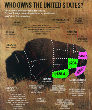
Figure 1: Original Chart, without green and pink colored sections we added, was published in Newsweek's June 8 2009 print version. Look at the two pink areas we colored-in above. Luxembourg's purchase of $106.1 billion is 50% smaller than "All Others" at $156.7 billion. Yet Newsweek makes the $106.1 section larger than the $156.7 section? Why?(Click image to enlarge) (Michael Melford, National Geographic Stock Photos).
Will China and other countries stop buying US Treasury bonds just when we need the cash for bailouts? Christian Science Monitor reports, “Some of the most prominent nations reduced their Treasury holdings in April…China pared its stake by $4.4 billion, to $763.5 billion total.” Citizens are right to worry.
With all the public sensitivity regarding total U.S. Treasury debt, Newsweek should have been up to the task when making a pie chart out of a Buffalo graphic to represent foreign government ownership. Instead they came up with Grade F mystery meat. (See Figure 2 below).
The back page chart in Newsweek’s June 8, 2009, print issue, a new section featured in their re-design, was supposed to visualize the proportions of U.S. debt owned by foreign countries. The meat cuts-style graphic wryly suggests, via our Buffalo symbol, that America is being butchered and consumed by foreign government debt.
But look at the two pink areas we colored-in. See Figure 1 above. Luxembourg’s purchase of $106.1 billion is 50% smaller than “All Others” at $156.7 billion. Yet Newsweek makes the $106.1 section larger than the $156.7 section?
The “France through Chile” group’s $204 billion purchase of USA bonds–see green sections–is obviously much larger than Russia’s investment of $138 billion, which is nearly 50% less. So why the heck did Newsweek represent Russia’s purchase, $138 billion, in a larger squared section than France through Chile’s holdings of $204 billion?
Bloggers wrote about the buffalo chart only in the context of Newsweek’s newly launched re-design. None, apparently, noticed that things were wrong with the chart. LizR128 writes, “I nearly overlooked the ‘Back Story’ ‘Who Owns the United States?’ [chart] because,again, it looked like an ad or like a diagram of cuts of meat from my parents’ old Joy of Cooking.” Byron’s Blog said, “I must admit I was pretty surprised by some of the countries listed and the amount of US debt they owned.”
They refer to the last page of Newsweek’s June 8 2009 issue, a section called “Back Story,” which displays a photograph of an American Buffalo with the provocative headline “WHO OWNS THE UNITED STATES?” The sub-heading continues, “The national debt is roughly $11 trillion. Of that, foreign ownership is about $3.3 trillion. Here’s how it’s carved up:” My initial response was “Oh no, it looks like foreign countries own us lock, stock and barrel.”
The meat cuts-style graphic wryly suggests, via our Buffalo symbol, that America is being butchered and consumed by foreign government debt.
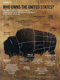 Figure 2: Click to see Newsweek’s original chart –unaltered. (Click image to enlarge). |
|
|
But a closer look reveals, the buffalo, when carved up “butcher diagram style” (Figures 3A & 3B), only shows the proportions of debt owned by foreign countries taken from a March 2009, Department of Treasury, “Major Foreign Holders of Treasury Securities Holdings” list. America’s holdings of itself, $7.7 trillion, are not represented.
Here are my three beefs…
BEEF #1 The proportions of sections make no sense in relation to the numbers and the countries
First, look at the two areas we colored-in–see pink and green sections above in Newsweek chart. Refer to Figure 1.
As noted earlier, Newsweek represents the $106.1 billion section as larger than the $156 billion segment. But Luxembourg’s purchase of $106.1 billion is 50% smaller number than “All Others” at $156.7 billion.
Russia’s real position as 5th largest holder of U.S. securities is clearly not evident in this bull chart.
How is Russia’s purchase of $138 billion correctly represented in a squared area larger than France, India, Korea, Mexico et al’s $204 billion purchase?
Go figure? Newsweek’s buffalo chart seems more suited to the geometric distortions witnessed by Alice in Wonderland than to their news pages.
BEEF #2 How the countries are bundled together make no sense until you do research…and even then. Crazy.
What do “Egypt, Israel, Italy, Netherlands, Norway and Thailand” have in common? Newsweek bundles them into one group on this chart. Why?
Did they purchase a particular bond at one time? Were they involved in a joint venture? It took a few minutes of research to figure it out. We went to the web site of the Dept. of Treasury March 2009 foreign holders of US Treasury Securities to see. Refer to March 2009 chart, detail here , Figure 4 below. (Only the current April 2009 chart remains online which includes March 2009 numbers now in the hierarchy of April’s numbers).
The debt purchased by each country is listed in hierarchical order. The biggest debt holder, China, with $767.9 billion in purchases, is number one on the list. The last individual country listed is Malaysia with $10.6 billion using March 2009 numbers.
 Figure 4: Click image to see detail, March 2009 , Department of Treasury, “Major Foreign Holders of Treasury Securities” list. Newsweek used the March 2009 version, no longer online (see current April version) to group unrelated countries together for its chart–without explanation. The red circles above, indicate how Newsweek derives the total debt owned for three sections of the buffalo–They added the six or seven countries’ purchases together. This list also shows how Newsweek’s seemingly illogical groupings, such as “Egypt, Israel, Italy, Netherlands, Norway and Thailand” came about |
It turns out the only thing that the “Egypt, Israel, Italy, Netherlands, Norway and Thailand” group had in common was that they were lifted from the correct hierarchical order —Norway, Thailand, Israel, Egypt, Netherlands, Italy–and then converted into alphabetical order.
Newsweek , inexplicably, did the same thing with Singapore through France and the Chile through Malaysia groupings. They convert the series from hierarchical to alphabetical order, then add their total ownership together to post as one number –not evidenced anywhere on the Treasury Department list– in their buffalo chart.
When Newsweek randomly adds unrelated countries and their purchases together, presumably to compress the Treasury list into limited squares, this hierarchical order—which country owns how much in relation to others—is lost, along with any meaningful relationship of the numbers.
Finally, since the United Kingdom is almost invisible on the Newsweek buffalo chart, it gives the false impression that our closest ally has not invested in us.
The “UK” is subordinated, inexplicably in Newsweek’s chart underneath “Channel Islands, Isle of Man (U.K.).” But, in reality, the opposite is true.
The Treasury clearly lists “United Kingdom” as owning the 5th most USA debt in April 2009 (6th most in March 2009 at $128.2 billion). Only a footnote mentions United Kingdom includes Channel Islands and Isle of Man.
BEEF #3 The “Who Owns the United States?” headline is confusing when combined with the bull representation that only features foreign debt holders–it’s also misleading.
At a quick glance, the headline “Who owns the United States?” when combined with the American Buffalo, a powerful symbol, gives the startling impression that the U.S. is owned in its entirety by foreign interests. Was that initial shock Newsweek’s intent?
I read the sub-heading, “The national debt is roughly $11 trillion. Of that, foreign ownership is about 3.3 trillion.” When I showed the chart to a friend, they asked, “What are we (referring to the U.S.), the head?” That was my initial thought too.
(The bull’s buttocks/tail area has no country designated, noted Robert Slavinski, computer graphic and animation expert here in the lab. Was it forgotten by Newsweek’s graphics department or did they avoid the potential fall-out of designating any country as the ass? See Figure 6 below.)
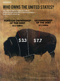 Figure 5: We propose that the national debt would be more fairly represented in the above manner: The whole buffalo represents the $11 trillion debt, which is then divided into two parts, domestic ownership ($7.7 trillion) and foreign holdings ($3.8 trillion) .(Click image to enlarge). |
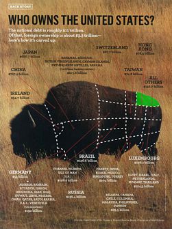 Figure 6: Robert Slawinski noticed that one section–the buttocks–had no assigned country. See green section above. Did Newsweek graphics people forget or did they try avoid controversy…resulting from symbolically making one country the ass? (Click image to enlarge) |
Since the whole debt is $11 trillion, of which $3.3 trillion is a small part, is it fair or accurate to represent just the foreign debt as the entire buffalo?
In order to give the public perspective on the sensitive subject, should’t the whole buffalo be divided between $7.7 trillion, U.S. domestic ownership (the safe and overwhelming majority), and $3.8 trillion foreign ownership (a potentially dangerous minority)? See Figure 5 above.
Here in our chart the approximate ratio between U.S. and foreign debt is made ($11 trillion total divided between $3.3 trillion foreign and $7.7 trillion U.S. owned). We left out the subdivisions of the foreign debt holders as this simple parsing makes our point.
When there are potentially serious political ramifications involved with charts, such as one that examines national debt and foreign ownership, numbers need to be better represented by Newsweek. This is especially glaring in an issue of the magazine that takes major shots at TV host “Oprah” in its cover story for promoting wacky statistics and science.


"Luxembourg’s purchase of $106.1 billion is 50% smaller than “All Others” at $156.7 billion." 156 is (roughly) 50% larger than 106 but 106 is (again roughly) 33% smaller than 156. Quis ipsos custodes custodit?
The fact that you easily knew that this was an approximation (roughly), serves as a good example of why I decided not to add the word "roughly" or approximately. It did not seem necessary to state the obvious at some expense of readability. Your criticism is hair splitting –while I have shown significant exaggerations in Newsweek’s graphic–which was my point.
The diagram is clearly misleading, especially when many readers would casually look at the diagram get the wrong impression of the situation. Good work.